
Howdy.
After receiving some spirited feedback last week, it became abundantly clear that our communication channels can stand to be improved.
Thus, here we are. Welcome to the first e621 devlog, where I shall talk about some of the changes and features that will be coming in the future versions of the site.
If you have any feedback for me, please leave it below. Including whether you'd like me to continue making devlogs like this.
The only thing I ask is to be patient with me. We do not have a massive development or PR team here – as it stands, I am the primary developer for e621, with no budget or an abundance of time, but with some helpful contributions from other volunteer devs.
Release Pipeline
Before we begin, I need to clarify how releases work around here.
Some of you already know this, but some may not.
We are currently on a weekly release schedule.
New major versions of the site get rolled out every Wednesday. Sometimes, there are more minor patches deployed on other days – typically due to bugs being discovered.
However, we do not immediately deploy the latest changes to the live site.
Any major update is first rolled out to e926.net for testing purposes.
If you are in our Discord, you can receive updates whenever this happens in the #dev-announcements channel.
After a week on e926, the major version will be deployed on e621 – usually with some bug fixes, if needed.
Development Goals
The obvious goal here is to make the site better.
But that statement is so generic that it barely means anything.
Right now, my primary objective is to make the user experience better for mobile users.
Whether you like it or not – and I am old enough to dislike it – the majority of people interact with the site using a mobile device. To put this in more concrete terms:
- 50.4% of visitors use an Android device.
- 24.9% of visitors use an iOS device.
That is a massive number of people who likely had not been having a great experience on the site.
E621 had many updates since its creation, but at its core it is still a site from 2007, just with a fresh coat of paint here and there.
Of course, I do not intend to leave the desktop users by the wayside. After all, I myself am one such user.
What You Can Do To Help
Simply put, help me test this damned thing.
I could really use some feedback and / or bug reports on the builds that get deployed to e926 before they get pushed to the main site.
Any feedback is welcome, although I urge you to be constructive.
Simply stating that you dislike something is not terribly useful – I would like to know why you dislike it.
Upcoming features
The following changes had been released on e926.
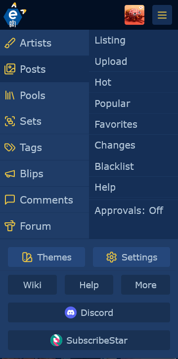
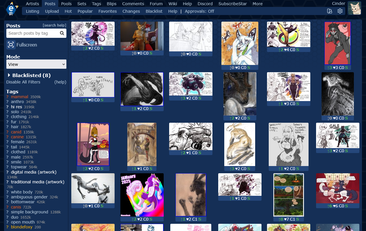
Main Menu Changes
This week had not seen as thorough of a rework of the menu as last time, but I still touched up on a few things.
One of the complaints regarding the navbar had been that getting to your account was somewhat inconvenient.
I've hopefully made a few steps in the right direction with this design.
Notably, I have added your current avatar and username to the header – clicking on either one will take you to your profile.
The buttons for the themes and settings have been moved lower to the far right of the secondary navbar, to save space.
This was actually somewhat challenging to implement, mainly due to the fact that usernames can be as long as 20 characters.
Also, some users have no avatar at all, so for now that button will display the first letter of their username.
We might have something better to replace it in the future, but this should work for now.
Additionally, the various menu icons had been replaced with new ones. This is most noticeable in the mobile menu.
For a while, the site had used font-awesome for its icons, which had its benefits and drawbacks. These new icons are instead SVGs from Lucide.
They offer a bit more flexibility – and also look better, in my opinion.
The mobile menu had also been tweaked to improve usability.
The primary navbar (on the left) had been adjusted to make it easier to click on the individual buttons.
Also, yes, the duplicate "Account" button is gone. Rejoice.
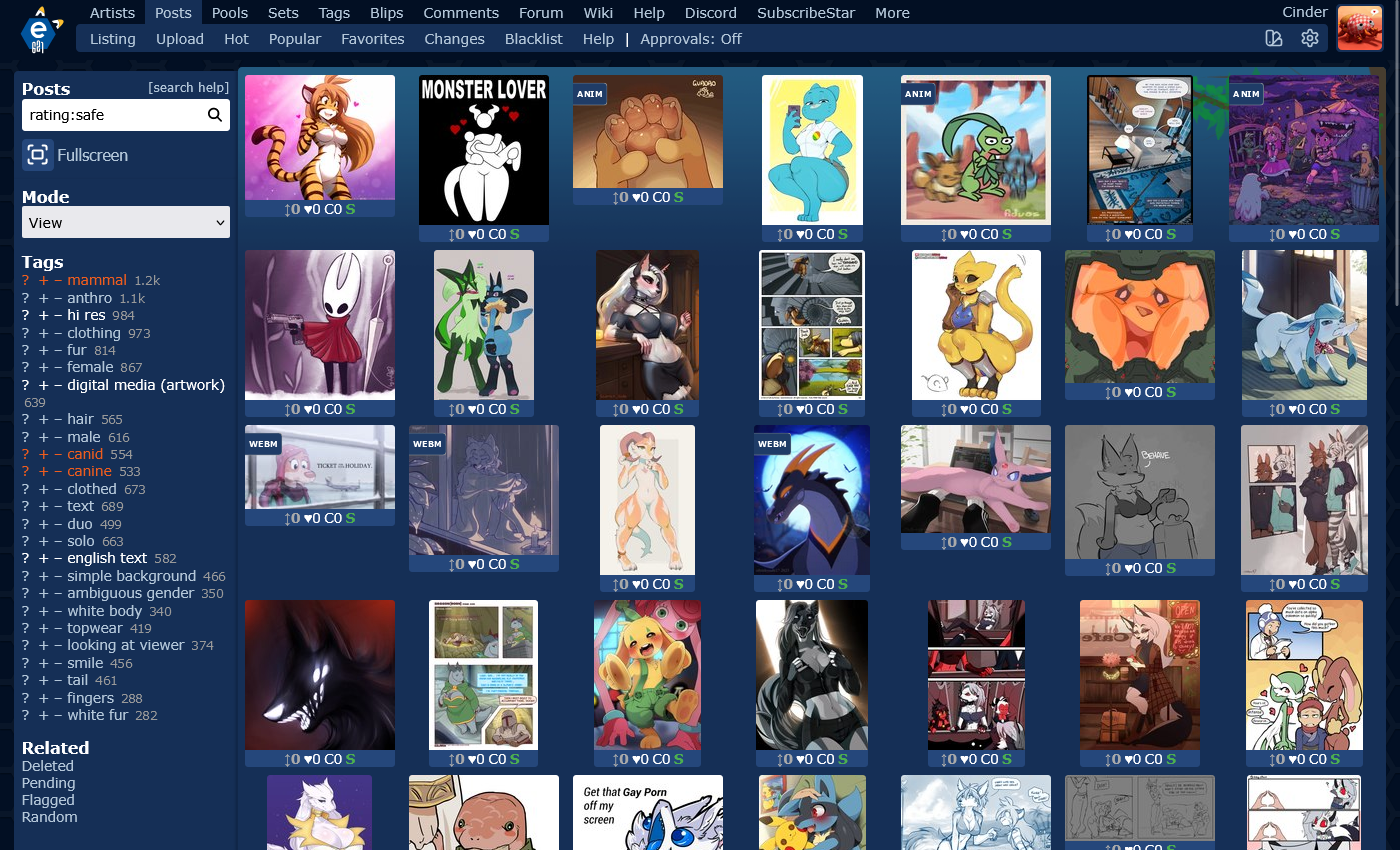
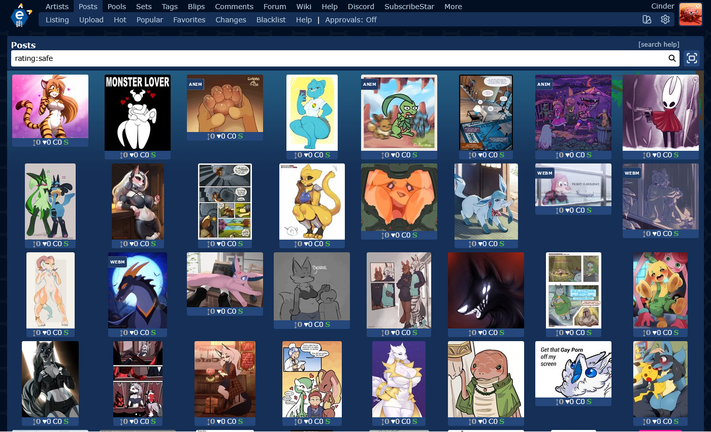
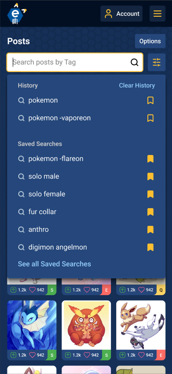
Search Page Changes
Last week, I reworked the layout of the search page to make it easier for me to shift items around.
It should be relatively unnoticeable – if you go to e621 right now, you might not even spot that something had changed.
However, it had made designing a layout that can accommodate both mobile and desktop users significantly easier.
This time, I made some visual changes to the desktop layout.
The sidebar is more visually separated from the rest of the posts.
One of the long-standing complaints regarding searching for posts on e621 had been that the tag input is not terribly convenient for long queries.
Last week's update already addressed this somewhat by making the input automatically expand vertically if the text is too long to fit.
This time, however, I've added a fullscreen mode to the search page, for a minimalist view.
(Don't tell anyone, but that's actually just the mobile view of the search page.)
This project actually started with me trying to fix pagination on mobile... and then things kind of got out of hand.
At least, the pagination should do a better job of not overflowing the page on mobile. In theory, at least.
Here are some screencaps at various resolutions: mobile, tablet, desktop.
It also had me contemplating limiting the maximum search pages to 99, since trying to fit three-digit numbers on there gave me a headache.
As an added bonus, clicking on the ellipsis ("...") now allows you to input a page number directly and be immediately taken there.
Home Page Changes
Nothing extraordinary this week, I'm afraid.
I did have to make some changes to fit the new main menu, but that should be relatively minor.
A bigger change is that the "Popular" button now takes you to the order:rank search, rather than the actual Popular page.
The justification for this is that while the Popular page is useful, it's not possible to search it. And the "rank" ordering provides a fairly similar output while also allowing you to narrow down the results based on your preferences.
And speaking of searching – now if you type something into the searchbox, clicking on either of the two buttons below will actually search for your input.
The "Popular" button will add order:rank to your search automatically, of course.
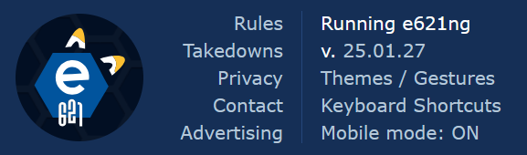
Footer Rework
Last week saw a minor redesign of the site footer, especially on mobile.
That... did not work especially well, actually. It ended up a little wonky and also a little buggy.
This week's attempt actually looks pretty decent, in my opinion.
As an added bonus, it explicitly states the release number that the site is currently running. Somehow, that was not a feature before.
You can thank binaryfloof for that change.
Other Miscellaneous Stuff
I fixed a few bugs here and there. In no particular order:
- The sitemap page was overflowing on mobile due to a very silly design decision.
- Privileged users can now use the "apply to all" button for the tag scripts, instead of it being restricted to staff only.
- The wiki excerpt on the search page got restyled to look a bit nicer.
- The related posts on the posts/show page used to get misaligned if one of them was blacklisted.
- The related tags on the upload page now include a "Contributor" category button.
- The guest warning dialog got restyled to look a bit nicer.
Additionally, a few changes were made by the volunteer developers.
- binaryfloof fixed a rather irritating issue with the user feedback history.
- Tarrgon fixed a bug on the comment index page that could cause the site to throw an error if you stumbled upon your own deleted comment.
Thank you to both of them for their contributions.
The full changelog is available in this thread, as well as on github.
Updated