Tokaido said:
Needs more decals!
Yeah, like maybe some cool flames and a bumper sticker that says "my other aircraft does barrel rolls".
Updated by anonymous
Posted under Art Talk
Tokaido said:
Needs more decals!
Yeah, like maybe some cool flames and a bumper sticker that says "my other aircraft does barrel rolls".
Updated by anonymous
parasprite said:
regular porn
Excuse me?
TheHuskyK9 said:
Gimme ALL the critiques!
It doesn't feel right critiquing something I requested :\ and I don't know how useful this will be since I'm not sure if you'll ever do a plane again, and I'm probably judging the wrong things because I'm an aviation fanatic, but here I go:
Most smaller aircrafts' landing gears these days have two rear wheels which are usually closer to the center. Also, what Tokaido said- the wings (and tail) should be a lot bigger.
I feel the need to say something about the lack of control surfaces but that's really nitpicky. I know it's in space, but the nose and the area behind the canopy don't look incredibly aerodynamic. The rest is good in that respect, though.
The canopy looks almost matte; I can see that it does have a reflection but I had to turn my brightness all the way up notice that.
Now, the good stuff: I love the colors. The blue dominance looks really nice and the reflections are pretty cool. By the way, who told you my favorite color?
Bonus points for the sun being white, the color it would actually appear in space. And this is kind of weird to say, but I like how you did the vertical stabilizer (i.e. the vertical fin on the back).
By the way, spaceplanes are a real thing!
Updated by anonymous
Durandal said:
Excuse me?
You know, that thing where everybody is a "teen milf lesbian slut taking a meat stick up the shithole" regardless of age, gender, or what they exactly mean by "meat stick".
I'm so spoiled here. :P
Updated by anonymous
Tokaido said:
Short critique since on phone, and 3D images are hard to critique.I like the overall shape, its obviously a plane/spacecraft and its very easy to tell. I also love how you put it in space like that XD gives the picture a feeling of life.
Big critique: the wings look a bit flimsy, I'm not sure they'd support this thing in atmo. The landing gear looks a bit... for lack of a better word "exaggerated," like maybe the landing gear is just too big. What kind of ship is it supposed to be, what's its purpose?
Small critiques/suggestions. Needs more decals! Like, what company made it, where's the cockpit open, etc etc. Stickers showing those kinda details make things look manufactured, which is very helpful for spacecraft and junk. But I understand that texturing is a ton of work. Also, it has a lot of cockpit space, but not much room for anything else, that could be subjective though.
Thank you, I will remember this next time
Durandal said:
It doesn't feel right critiquing something I requested :\ and I don't know how useful this will be since I'm not sure if you'll ever do a plane again, and I'm probably judging the wrong things because I'm an aviation fanatic, but here I go:
You know definitely know more about planes than I do, that's for sure. So your critique is very important to me. Not saying everyone elses critique isn't important but who else knows about planes on here?
Most smaller aircrafts' landing gears these days have two rear wheels which are usually closer to the center. Also, what Tokaido said- the wings (and tail) should be a lot bigger.
I feel the need to say something about the lack of control surfaces but that's really nitpicky. I know it's in space, but the nose and the area behind the canopy don't look incredibly aerodynamic. The rest is good in that respect, though.
The canopy looks almost matte; I can see that it does have a reflection but I had to turn my brightness all the way up notice that.Now, the good stuff: I love the colors. The blue dominance looks really nice and the reflections are pretty cool. By the way, who told you my favorite color?
Bonus points for the sun being white, the color it would actually appear in space. And this is kind of weird to say, but I like how you did the vertical stabilizer (i.e. the vertical fin on the back).
Are you guys sure that y'all aren't professional critics? You guys are good at this. Thank you for the critique
By the way, spaceplanes are a real thing!
Sweet mercy!
Updated by anonymous
Durandal said:
Most smaller aircrafts' landing gears these days have two rear wheels which are usually closer to the center. Also, what Tokaido said- the wings (and tail) should be a lot bigger.
I don't how how realistic it is, but in Battlefield, there were small aircrafts, not exactly designed for combat (You'd have a hell of a time shooting the broad side of a barn with it, and it had small caliber), but it did have shorter wings than this and flew really quick.
My complaint is that the thing is too dang smooth! It appears to all be one solid object, no signs of plating or welding whatsoever. And with that level of luster to it, it would stick out like a sore thumb, something that's not good if you're flying such a small craft.
Edit: Looked at an image of a BAE Hawk, and it is fairly smooth... though there are some obvious marks upon it, as well.
Updated by anonymous
Furrin_Gok said:
I don't how how realistic it is, but in Battlefield, there were small aircrafts, not exactly designed for combat (You'd have a hell of a time shooting the broad side of a barn with it, and it had small caliber), but it did have shorter wings than this and flew really quick.
Which ones are you talking about? Because I've played some of the recent Battlefield games and I have no idea.
There are a lot of different factors that determine how big the wings should be...
Furrin_Gok said:
And with that level of luster to it, it would stick out like a sore thumb, something that's not good if you're flying such a small craft.
True, but at that altitude it wouldn't really matter. Unless you're trying to stay hidden from space shuttles.
Updated by anonymous
Furrin_Gok said:
... My complaint is that the thing is too dang smooth! It appears to all be one solid object, no signs of plating or welding whatsoever...
For future reference, that's often called "construction history" in the 3D art world. Its where you add "the left over details showing how things were built" like seams and stuff. And I agree with you completely, it would add a lot to the aircraft to have a few seams I'm the mwtal. But it can be super difficult to add that kinda detail insometimes, especially since I'm fairly sure Husky didn't lay out the UVs yet (correct me if I'm wrong!).
Updated by anonymous
Hey, could I get some critique on a couple of sketches I'm workin on?
Notes:
1.) For the first two, ignore the background... that was just for fun during the stream, lol. I wanna know what you think of the pose and the flow. Currently wondering which pose is preferred (leg up or leg down) as the commissioner and I haven't been able to agree on one or the other yet. EDIT: Oh, and I forgot to say, the boobs on this one are squished together because she'll eventually be wearing armor. So her boobs will be in a bra under all that, thus why the're so supported right now.
2.) For the last three, they're in reverse order for whatever reason (thanks imgur) but they're a series of images for our very own NMNY. Just want some general feedback on those before I go any further with them.
3.) Any and all critique welcome, as anything is easily changed at this stage.
Thanks!
Updated by anonymous
Leg down is better, but I already said that during the stream.
For my own commission I have to say that it now looks strange that the dildo is vacuumed inside.
Maybe add a summoned hand pushing it in?
Seeing how that bitch is a warlock I'd suggest a Voidwalker hand, basically just a feature less, purple/shadowy looking claw, though I'd have to check what the summoning circle looks like (it's rather simple but not a pentagram anymore). Also, bracelet is optional since it's only a partial summoning, only full summons require the bracelets.
Otherwise it looks good so far, the hand needs claws and the rest comes with the colors and details.
Updated by anonymous
NotMeNotYou said:
...Maybe add a summoned hand pushing it in? Seeing how that bitch is a warlock I'd suggest a Voidwalker hand...
Oooh, I like that idea a lot actually. That's awesome. Having the summoning circle would be great to, that'd be a cool detail to add to the ground :D
Updated by anonymous
Best I could do without my machine.
Going to make some better Screenshots of the circle tomorrow, but that should give you an idea.
Updated by anonymous
Tokaido said:
Hey, could I get some critique on a couple of sketches I'm workin on?Notes:
1.) For the first two, ignore the background... that was just for fun during the stream, lol. I wanna know what you think of the pose and the flow. Currently wondering which pose is preferred (leg up or leg down) as the commissioner and I haven't been able to agree on one or the other yet. EDIT: Oh, and I forgot to say, the boobs on this one are squished together because she'll eventually be wearing armor. So her boobs will be in a bra under all that, thus why the're so supported right now.
2.) For the last three, they're in reverse order for whatever reason (thanks imgur) but they're a series of images for our very own NMNY. Just want some general feedback on those before I go any further with them.
3.) Any and all critique welcome, as anything is easily changed at this stage.Thanks!
Not really a critique, but wanted to pass on just how much I love that sequence of expressions on her face as the penis/dildo goes in. I love that reflection of what she's experiencing, implying what it feels like. Makes it more sexy and amusing instead of just sex mechanics. I adore the little details like that. So yeah, I kept scrolling up and down a couple of times just to enjoy that progression. =)
Updated by anonymous
furrypickle said:
Not really a critique, but wanted to pass on just how much I love that sequence of expressions on her face as the penis/dildo goes in. I love that reflection of what she's experiencing, implying what it feels like. Makes it more sexy and amusing instead of just sex mechanics. I adore the little details like that. So yeah, I kept scrolling up and down a couple of times just to enjoy that progression. =)
Lol! Glad you liked it. Its exactly what NMNY had specified in the commission form, and I'm super happy it came out looking that way :3
Updated by anonymous
Updated by anonymous
TheHuskyK9 said:
It's that time again
Whatever tools you're using, just stop, they aren't doing you any favors. It looks like graphite to me, but this picture has some kind of weird pen-ish quality that's bugging me.
It's painfully obvious that you're right handed and your mark making is biased to a sort of bottom-left to upper-right movement. You need to untrain that as soon as possible. If you continue to use the pencil, turn it over in your hand and draw only using your index finger and thumb. Turn your medium around when you make marks, don't draw on the pad at some unnatural angle to your motion.
Get some cheap compressed charcoal sticks and just make a million gesture drawings. You're currently one of those thousands of drawers I see that moves into making "finished" linework when they don't even have the basic ability to control their own hand movements correctly.
At least I can say you have some concept of line weight, but that's not going to do you any good right now.
Updated by anonymous
Ozelot said:
Whatever tools you're using, just stop, they aren't doing you any favors. It looks like graphite to me, but this picture has some kind of weird pen-ish quality that's bugging me.It's painfully obvious that you're right handed and your mark making is biased to a sort of bottom-left to upper-right movement. You need to untrain that as soon as possible. If you continue to use the pencil, turn it over in your hand and draw only using your index finger and thumb. Turn your medium around when you make marks, don't draw on the pad at some unnatural angle to your motion.
Get some cheap compressed charcoal sticks and just make a million gesture drawings. You're currently one of those thousands of drawers I see that moves into making "finished" linework when they don't even have the basic ability to control their own hand movements correctly.
At least I can say you have some concept of line weight, but that's not going to do you any good right now.
Hard criticism....I like it
Updated by anonymous
TheHuskyK9 said:
It's that time again
Oh god. The right side of his muzzle (our left) looks like it's bigger, or jutting out further, to give if that square shape at the end. He's being seen at an angle, so scrunch up that side of the muzzle a bit (Hint: Perspective on a rough draft may help, if you have a photo manipulation tool to support it) to give the appearance of it being further away from the viewer, even if just by a little bit.
The right eye (Again, our left) legitimately looks bigger, not the same size, but BIGGER. This is the opposite of what you should be doing--just like with the muzzle, you want to scrunch it up a bit, vertical-wise. Horizontal-wize it's probably fine, though a bit of squeezing may help, too.
The ears are surprisingly great. His left ear is slightly larger than the right, which falls in line with perspective.
Updated by anonymous
Ps: No need to talk about the background, I already know that is a disaster.
Updated by anonymous
Darkcelona said:
I'm Back!.
post #611340
Hmm IMO that bottom lip could be a bit smaller and eyes are a bit too small. Everything is else is all fine and dandy. Digging the background and ball
Updated by anonymous
TheHuskyK9 said:
Hmm IMO that bottom lip could be a bit smaller and eyes are a bit too small. Everything is else is all fine and dandy. Digging the background and ball
Aren't those eyes actually too big for the standard Sergal designs?. I mean, I tried to make Them smaller than in the previous image.
Updated by anonymous
Darkcelona said:
post #611340
Lots of little things I could cover, but this is all in all a pretty good image. So I'll just give my one or two big critiques.
Let me first say that the pose is great. I don't know if you used a reference image or not, but it doesn't really matter. If you did use one, you did an impressive job with taking it ant making it your own. If you didn't use a reference, daaayyyuuum son!
Big critique: the jaw and mouth are very off. Fuckin wedge headed characters man, I know your pain. First and foremost is that she has a serious case of under bite right now. You gotta move that jaw back some. I suspect that happened because you just moved the jaw down to open the mouth, but that's not how jaws work. They rotate, not translate. Take your hand and put it on your jaw, then open and close your mouth, you can feel it rotating. It hinges from somewhere just in front of and below your ears. Very similar with characters with muzzles. Keep that in mind next time you draw an open mouth. The jaw will rotate, giving it the appearance of moving both down, and back. Second is that you can see through her mouth to the other side of her head, but the way the rest of her head is positioned, you shouldn't be able to do that. Instead, you should see her tongue and the base of her mouth, because that would be in the way from our viewing angle. I also feel like the hair on top of her head is too far forward. It makes her head look a bit misshapen. I'd suggest moving that back a little bit, maybe like 3 inches. Oh, one last thing, I also feel like her feet are too small, and that shed be a bit unbalanced on those.
Lastly, I think the eyes are fine myself. They're a bit big, bit that gives it a slightly cartoony feel, which I feel fits your current style nicely. So in other words i like em, its subjective though, so don't take just my word for it :P
Updated by anonymous
Tokaido said:
Let me first say that the pose is great. I don't know if you used a reference image or not, but it doesn't really matter. If you did use one, you did an impressive job with taking it ant making it your own. If you didn't use a reference, daaayyyuuum son!
I only use references to Sketch practising, for images that I want to Colorize I try to make the pose from scratch.
Updated by anonymous
TheHuskyK9 said:
It's that time again
What just happened here?, I just saw your previous hand-drawn images and comparing them with this one, is just horrible.
-The shape of the skull doesn't exist.
-the eyes are poorly designed, they should look either more round or slit because they look painfully stretched. (also it seems that the poor guy is suffering from Strabismus).
-And the snout is the worst part the position makes it look like his face were melting, the lower jaw is simply out of place. (and the chin looks straight off of Jim Carrey's face)
-That piercing in the right ear doesn't look like a piercing at all, it looks more like a piece of bent plastic attached there.
-What's up with the neck, is he a giraffe hybrid?. because is too long, thick and straight.
I don't think that I can continue anymore but before end up, I need to ask you. Do you hate Foxywolfanubis?.
Updated by anonymous
Darkcelona said:
I don't think that I can continue anymore but before end up, I need to ask you. Do you hate Foxywolfanubis?.
No, I've been on an off-streak lately :/
Currently, I'm having a lot of difficulty drawing a simple sharkgirl request
Updated by anonymous
TheHuskyK9 said:
No, I've been on an off-streak lately :/
Currently, I'm having a lot of difficulty drawing a simple sharkgirl request
That makes me think of why put pointy ears in shark heads?.Besides of make them look cooler of course
Say, Could somebody Help me to give a name to my Sergal Thing. If there is something where i am really bad even worst than backgrounds are the names, I'm a disaster trying to create names. I already got a name for my charizard thing post #577768, But with the other one I simply can't think of something.
Updated by anonymous
http://www.furaffinity.net/view/16009719/ I need critique
Updated by anonymous
TheHuskyK9 said:
http://www.furaffinity.net/view/16009719/ I need critique
It's a bit hard to say, due to the darkness of it. Seems like you're doing a good job with objects with more curvature, though! Did you have anything else planned for this particular project?
Updated by anonymous
TheHuskyK9 said:
http://www.furaffinity.net/view/16009719/ I need critique
I'd say you need to give the light coming from the TV a stronger direction. Right now it mostly look like ambient lighting, such a bright image would create stronger, direct light.
Updated by anonymous
Misappropriated said:
It's a bit hard to say, due to the darkness of it. Seems like you're doing a good job with objects with more curvature, though! Did you have anything else planned for this particular project?
Just trying to improve my environmental skills
Peekaboo said:
I'd say you need to give the light coming from the TV a stronger direction. Right now it mostly look like ambient lighting, such a bright image would create stronger, direct light.
Got it
Updated by anonymous
TheHuskyK9 said:
http://www.furaffinity.net/view/16009719/ I need critique
I already gave my suggestion on the FA page, but to be more precise, the scene is just too dark to see what's going on. I can totally understand where you're trying to take it though, "dark room only lit by the TV." While that might be accurate in real life, it doesn't make for a good scene.
There's an easy way to fix that though, put some rim lighting on that bitch!
If you can't tell, I love rim lights :P
Oh! And the key to any scene is to have a is light setup, like they do for movies n stuff. You should have one keylight (main source of light), a fill light (that fills in the shadows a bit, so they're not pure black), a rim light (to pop out the main elements from thebackground), and in 3D you have to add a bounce light, because unless you render with light rays, global lighting, and ray bounces, reflected light has to be done by hand.
Updated by anonymous
Tokaido said:
I already gave my suggestion on the FA page, but to be more precise, the scene is just too dark to see what's going on. I can totally understand where you're trying to take it though, "dark room only lit by the TV." While that might be accurate in real life, it doesn't make for a good scene.There's an easy way to fix that though, put some rim lighting on that bitch!
If you can't tell, I love rim lights :P
Oh! And the key to any scene is to have a is light setup, like they do for movies n stuff. You should have one keylight (main source of light), a fill light (that fills in the shadows a bit, so they're not pure black), a rim light (to pop out the main elements from thebackground), and in 3D you have to add a bounce light, because unless you render with light rays, global lighting, and ray bounces, reflected light has to be done by hand.
Lights, lights everywhere! Even in the dark
Updated by anonymous
Updated by anonymous
TheHuskyK9 said:
More critique!
The first thing I'd probably suggest is reviewing anatomy, since things like proportions and limb placement are important, even for more cartoony characters.
Sharks are a nuisance to anthro-fy under typical circumstances without making huge edits to a shark's...head? face?...region-thing. If you were wanting to have a smoother transition between the neck and head (to bring it more in line with an actual shark), usually the neck would need to be thicker. However, sharks are honestly one of those things where there's as many ways to render them as your imagination can conjure up.
The shading's positioned fairly well! The lighting ends up feeling consistent for the most part, although some areas seem to be lacking cast shadows that're present elsewhere, like her right breast (our left). Another thing that can help give art a sense of depths when it comes to the shadows is making sure there's contrast, so don't be afriad to have some darker darks in the more recessed shadows.
Updated by anonymous
Misappropriated said:
The first thing I'd probably suggest is reviewing anatomy, since things like proportions and limb placement are important, even for more cartoony characters.Sharks are a nuisance to anthro-fy under typical circumstances without making huge edits to a shark's...head? face?...region-thing. If you were wanting to have a smoother transition between the neck and head (to bring it more in line with an actual shark), usually the neck would need to be thicker. However, sharks are honestly one of those things where there's as many ways to render them as your imagination can conjure up.
The shading's positioned fairly well! The lighting ends up feeling consistent for the most part, although some areas seem to be lacking cast shadows that're present elsewhere, like her right breast (our left). Another thing that can help give art a sense of depths when it comes to the shadows is making sure there's contrast, so don't be afriad to have some darker darks in the more recessed shadows.
Advice noted. Thank you
Updated by anonymous
Updated by anonymous
http://imagizer.imageshack.us/v2/1024x768q90/538/TnTWud.png
I need someone to tell me where I'm going wrong here, because I know I am going wrong somewhere. You can draw on the image to illustrate a guideline or something if you wish.
I don't know how to draw hands apparently lol, especially with claws as fingertips.
Updated by anonymous
Bumping for great justice!
Updated by anonymous
Arcanine09 said:
http://imagizer.imageshack.us/v2/1024x768q90/538/TnTWud.pngI need someone to tell me where I'm going wrong here, because I know I am going wrong somewhere. You can draw on the image to illustrate a guideline or something if you wish.
I don't know how to draw hands apparently lol, especially with claws as fingertips.
I say it's pretty good. Would love to see the finished version so I can properly critique it.
Updated by anonymous
Arcanine09 said:
http://imagizer.imageshack.us/v2/1024x768q90/538/TnTWud.pngI need someone to tell me where I'm going wrong here, because I know I am going wrong somewhere. You can draw on the image to illustrate a guideline or something if you wish.
I don't know how to draw hands apparently lol, especially with claws as fingertips.
Sorry for the slow responses on this thread, I've been distracted lately >.<
I dunno, looks pretty good to me! You've definitely got the three main points down on the female Absol there, the face, the pose, and the weight, only problems are some slight anatomy things.
http://i.imgur.com/4LxpKmD.png
The good points
I labeled the points that I think are really good already, but I also really want to commend you on the pose. Whether or not you used a reference, it looks very good! But also have to comment again on how much I love the expression, eyes, and mouth. Bravo!
The critique
1: This is just a nitpick, but the boobs look off, a little too "teardrop" shaped, maybe add some extra curve to the top? Might be subjective though, so take this one with a grain of sailt.
2: The ribcage doesn't bend at the back, it stays rigid, and it's a convex (outward curve) shape.
3: Don't forget to add the curve of the forearms past the elbow here, arms aren't straight tapered lines like sticks. This pose might be a bit difficult for the arms, because they look to be hyper extended at the elbow. I highly suggest looking up reference if possible, or just taking pictures of your own arms in a similar alignment. Good on ya for choosing a complicated pose though
4 and 5: Do some hand studies! Seriously, the best thing you can do to get good at hands is to draw them a lot, and they're very important to get right. At least, IMO. So I think you should try to take the time to draw your non-dominant hand a few times every day for a while. It's great practice!
6: The chest muscles on the lower character (minotaur?) are a bit off. Make sure to make his pecs and deltoids make the form I drew there. It's generally referred to as a "cowl," because it looks like what batman might wear, right? :P (In addition, don't forget those juicy abs. They're essential! But I figured you just hadn't gotten to em yet)
7: The way you have it drawn right now, her knee joint is... big? Or somethin like that. You just need to bring the angle of the leg in a bit.
8: Probably just there for sketching purposes, but if you get rid of the line I squiggled over that'll practically complete that guy's leg there.
In all honesty though, this is pretty dang good. I like it, and look forward to seeing it finished! And all my critique points are just suggestions, so feel free to refute any of them.
Updated by anonymous
I know I'm not at the level of doing my own artwork (or linework), but at least I can color, so I colored post #619104 and just tried shading. I'd like to know how am I going. :3
https://www.dropbox.com/s/59l8aku22n8fqd7/pinka2.png?dl=0
For me, it looks good but I want to have several opinions. Also, don't mind the background, it's just a filler.
Updated by anonymous
Xch3l said:
I know I'm not at the level of doing my own artwork (or linework), but at least I can color, so I colored post #619104 and just tried shading. I'd like to know how am I going. :3https://www.dropbox.com/s/59l8aku22n8fqd7/pinka2.png?dl=0
For me, it looks good but I want to have several opinions. Also, don't mind the background, it's just a filler.
I like it. <3
Updated by anonymous
furballs_dc said:
I like it. <3
Uh... anything else? Like, rough shading somewhere?
Updated by anonymous
Xch3l said:
I know I'm not at the level of doing my own artwork (or linework), but at least I can color, so I colored post #619104 and just tried shading. I'd like to know how am I going. :3https://www.dropbox.com/s/59l8aku22n8fqd7/pinka2.png?dl=0
For me, it looks good but I want to have several opinions. Also, don't mind the background, it's just a filler.
(Ignore this part, since I apparently can't read--unless you'd like some useful info on backgrounds!) I think the background in this case could do with some reworking. It's nice, if your character isn't in a specific setting, to have some form of abstract background like what you have here, but this one ends up being a bit too distracting. Usually you should try to aim for a background with less visual interest in comparison to the character, and try to avoid having it share values that are too similar to that of the character. So, a character with lighter colors or values would benefit from a darker background so they'll 'pop' more, and vice versa.
Keep in mind with drawing bits that they do tend to protrude slightly forward from the pelvis, so it wouldn't necessarily be hanging straight down like what's depicted here.
I'm actually a big fan of the expression on the face, so good on you for that! The eyes need a bit of adjusting--and for this you can try drawing spheres to represent the eyeballs and using those to get a better idea of where the pupils should be placed.
The shading's a tad inconsistent, so be sure you have a clear idea of the lightsource in your head. Even something as simple as having a little ball scribbled on a different layer to show where the light is hitting and where it's coming from can be beneficial.
Keep up the good work, hope this helps. o'o/
Updated by anonymous
@savageorange:
If you want to get better at shading I would recommend using a bolder shading style (eg cel-shading). With an airbrushy style it's easy to think you have something that looks good but actually has messed up (overly smoothed together, no corners; or just plain nonsensical) planes.
I tried that at first but since I'm using my laptop's touchpad and I'm shaky as fuck (no, not because of that) the shading seemed like cut-off so I decided with that style. Which is actually a copy of the color layer where I erased (paint.net's eraser at 100px size, 0% hardness)
In terms of accurate image display, Imgur is probably better than Dropbox's interface. A medium grey (#bababa) background is ideal for accuracy but I haven't found a site like that myself.
Noted
Skin at crotch seems too light -- wouldn't it be shaded by the shirt?
Whoops. I overlooked that. n_n;
Not really sure what you are going for with the color choice. A darkened room? The background doesn't really fit with that. This is actually a fairly major issue, you have a bluish Pinkamena with low contrast on a background that is reddish and has higher contrast. This overall flags Pinkamena as the actual background element and the background as a foreground object that she's popping through. The ground and her mouth are the only things that contradict that idea. Perhaps you could comment on your vision of what her surrounds, particularly those directly opposite her front, look like?
Well, as I said, the background is just there to fill. Was playing around with it and tried to give focus to Pinkamena... but that didn't work. I thought that using a dark background would make the entire image too dark. As for the colors, I tried using her show's palette from here.
Here's one without the background (and without Dropbox's UI)
@Misappropriated
I think the background in this case could do with some reworking. It's nice, if your character isn't in a specific setting, to have some form of abstract background like what you have here, but this one ends up being a bit too distracting. Usually you should try to aim for a background with less visual interest in comparison to the character, and try to avoid having it share values that are too similar to that of the character. So, a character with lighter colors or values would benefit from a darker background so they'll 'pop' more, and vice versa.
Some? I'd say a lot... Actually, I just tried with a darker one and Pinks does stand out
Keep in mind with drawing bits that they do tend to protrude slightly forward from the pelvis, so it wouldn't necessarily be hanging straight down like what's depicted here.
I didn't have an idea on how that would look so I just left it like that (which is bad, right?)
I'm actually a big fan of the expression on the face, so good on you for that! The eyes need a bit of adjusting--and for this you can try drawing spheres to represent the eyeballs and using those to get a better idea of where the pupils should be placed.
Forgot to mention that I didn't do the linework. That goes to glacierclear. I just did the coloring part and removing some stray lines here and there.
The shading's a tad inconsistent, so be sure you have a clear idea of the lightsource in your head. Even something as simple as having a little ball scribbled on a different layer to show where the light is hitting and where it's coming from can be beneficial.
The light should come from around the top-left corner. I'll do the scribbling a light in the future :)
Keep up the good work, hope this helps. o'o/
*thumbs up*
------
*takes notes* Thank you very much, guys.
Updated by anonymous
Xch3l said:
@savageorange:
I tried that at first but since I'm using my laptop's touchpad and I'm shaky as fuck (no, not because of that) the shading seemed like cut-off so I decided with that style. Which is actually a copy of the color layer where I erased (paint.net's eraser at 100px size, 0% hardness)
My sympathies.
If you are using such a masochistic device, I feel obligated to point out GMIC interactive colorize , since it allows you to arrive at a quality set of flats in a matter of 5 minutes, with a minimum of mouse interaction involved.
(You did do a good job with coloring cleanly, BTW. But I imagine it took longer than 5min, which is time you could otherwise be devoting to better shading etc.)
If your movements are shaky, consider the option of drawing polygonally (some programs have a tool for this; Krita has experiment brush, GIMP has 'freehand select' which actually supports both freehand and polygonal selections. Don't know what paint.net has.). This might feel crude, but from my experience with mouse drawing in the past, it's much easier to manage with an physically-challenged input device than any other method is, and you can produce smooth curves with practice.
Apps like MyPaint and SAI also have tools that allow you to draw a line and then adjust its curvature, which is well suited to mouse or trackpad also.
(all software I've mentioned so far except SAI is free + opensource and should be available for your platform.)
I'm gonna do a cel shaded version as a demo.
EDIT: Done, using GIMP, pencil tool with circle brushes ranging 5-25px, and a looot of Shift+clicking (draw line from last point to X). Not as fun or fluid as using tablet functionality, but quite workable. Will link if requested, otherwise will not post link.
Well, as I said, the background is just there to fill. Was playing around with it and tried to give focus to Pinkamena... but that didn't work. I thought that using a dark background would make the entire image too dark. As for the colors, I tried using her show's palette from here.
Well, the base color matches, but the darker color is more purple AFAICS than the darker color in your ref. This naturally makes her skin look bluer than the ref.
In regards to Pinkamena specifically, there is a 'too much local color' issue that many artists do not properly resolve: her colors and shading are exaggerated to convey mood, but in a more general context, it looks weird to have practically no shading (or to have her be too dark shown in sunlight, etc). So, independent of the show palette, you still need to decide what is her -actual- base color -- what color she should show as in an average amount of natural light. A choice that seems common among artists that actually bother to resolve this, is a 50%-or-so mix between Pinkie's and Pinkamena's commonly depicted coat colors . IMO that works well.
(EDIT: and was approximately the approach I took in my cel shaded version)
That's pretty much by way of saying that taking palettes literally can be problematic -- you need to factor out any mood lighting and other environmental lighting etc to guess at the natural color.
( If I get confused about this I usually fire up Blender and poke around with a basic sphere, material settings, and light position/settings until I'm satisfied I understand what should be happening)
Here's one without the background (and without Dropbox's UI)
Way better. The background now has lower visual priority than Pinkamena, since it is less saturated than her.
It's fine to be really vague BTW -- 4 or so flat, polygonal areas of color can be enough to adequately define an environment. It's always tempting to menace with flashy techniques, but it's really not helpful at all for learning.
I didn't have an idea on how that would look so I just left it like that (which is bad, right?)
If you don't know, it's better not to guess. If you're gonna do research to find out what it should look like, then by all means work to fix it.
Updated by anonymous
Tokaido said:
Sorry for the slow responses on this thread, I've been distracted lately >.<I dunno, looks pretty good to me! You've definitely got the three main points down on the female Absol there, the face, the pose, and the weight, only problems are some slight anatomy things.
http://i.imgur.com/4LxpKmD.pngThe good points
I labeled the points that I think are really good already, but I also really want to commend you on the pose. Whether or not you used a reference, it looks very good! But also have to comment again on how much I love the expression, eyes, and mouth. Bravo!The critique
1: This is just a nitpick, but the boobs look off, a little too "teardrop" shaped, maybe add some extra curve to the top? Might be subjective though, so take this one with a grain of sailt.
2: The ribcage doesn't bend at the back, it stays rigid, and it's a convex (outward curve) shape.
3: Don't forget to add the curve of the forearms past the elbow here, arms aren't straight tapered lines like sticks. This pose might be a bit difficult for the arms, because they look to be hyper extended at the elbow. I highly suggest looking up reference if possible, or just taking pictures of your own arms in a similar alignment. Good on ya for choosing a complicated pose though
4 and 5: Do some hand studies! Seriously, the best thing you can do to get good at hands is to draw them a lot, and they're very important to get right. At least, IMO. So I think you should try to take the time to draw your non-dominant hand a few times every day for a while. It's great practice!
6: The chest muscles on the lower character (minotaur?) are a bit off. Make sure to make his pecs and deltoids make the form I drew there. It's generally referred to as a "cowl," because it looks like what batman might wear, right? :P (In addition, don't forget those juicy abs. They're essential! But I figured you just hadn't gotten to em yet)
7: The way you have it drawn right now, her knee joint is... big? Or somethin like that. You just need to bring the angle of the leg in a bit.
8: Probably just there for sketching purposes, but if you get rid of the line I squiggled over that'll practically complete that guy's leg there.In all honesty though, this is pretty dang good. I like it, and look forward to seeing it finished! And all my critique points are just suggestions, so feel free to refute any of them.
Hi there! Thanks so much for this :3 I finished the piece a little too late and didn't check back for this.
http://imageshack.com/a/img901/7188/K5r5pQ.png
http://imageshack.com/a/img540/2599/ucgqR4.png
This is what I had so far. I'll be taking those in consideration :3
Also I did these recently.
https://e621.net/post/show/631945/ball_gag-battle_fennec_-artist-bdsm-blind_forest-b
https://e621.net/post/show/631944/ball_gag-balls-battle_fennec_-artist-bdsm-blind_fo
I think some things are way off though.
Updated by anonymous
May I ask for a little critique here?
I hope I improved since last time I posted something here, it's only two sketches, but soon, I'll upload a digital picture I have been working on. (Now in SAI yay)
A wolf
And my first attempt at a polar bear
Updated by anonymous
Arcanine09 said:
Hi there! Thanks so much for this :3 I finished the piece a little too late and didn't check back for this.http://imageshack.com/a/img901/7188/K5r5pQ.png
http://imageshack.com/a/img540/2599/ucgqR4.png
This is what I had so far. I'll be taking those in consideration :3
Also I did these recently.
https://e621.net/post/show/631945/ball_gag-battle_fennec_-artist-bdsm-blind_forest-b
https://e621.net/post/show/631944/ball_gag-balls-battle_fennec_-artist-bdsm-blind_fo
I think some things are way off though.
With regards to the houndoom art: the main thing I'd recommend is that you make sure that, when planning your compositions, that you're thinking in 3d. Even though the work you're creating only exists on a 2d plane, the characters themselves do occupy space in all three dimensions. With that in mind, some bits of anatomy would be visible--such as houndoom's other leg--whereas others may be hidden. Be sure you have a good idea of what sort of surface you want the characters resting on as well, since, given the angle indicated by the two characters' shoulders, we should be able to see some small bit of whatever it is they're lying on.
With regards to the bondage piece: Even cartoony characters obey some general rules regarding anatomy--here, the character's arms and hands are longer and larger than they probably should be. Working from references should be beneficial here, as well! While having a background is nice, without some small, or even simple, indication of lighting and shadow, there's nothing to indicate the character occupying space in the scene rather than simply floating, so even a little bit in this area can go a long way. The shackles(s) on the wrists should more than likely be connected to something--especially given that you added connectors and chains between the other sets.
Hope this helps a bit o'o/
Updated by anonymous
NoctemWerewolf said:
May I ask for a little critique here?
I hope I improved since last time I posted something here, it's only two sketches, but soon, I'll upload a digital picture I have been working on. (Now in SAI yay)
A wolf
And my first attempt at a polar bear
With regards to the first link: seems like you're getting a better handle on musculature! I would suggest, though, that you make sure that the different body parts are in proportion to one another. For instance, the crook of the arm is often near the vicinity of the navel height-wise. Ratios can be important to ensuring you give your characters the look you're going for! A common thing is to judge a character's height and the length of its limbs by how many heads tall they should be. The rendering is improved, but another thing that can help is a bit of shading of some kind. It doesn't have to be smooth gradients--in fact it can be rather flat, like cel-shading--but indicating a lightsource can help give your characters and scenes volume and 'sell' that they're occupying space.
With regards to the polar burr: A similar critique to the first with regards to ratios and proportions, though I commend you for trying different poses! Gotta be willing to experiment and branch out in order to improve. Remember that the human body, and by extension your polar bear's body, are three-dimensional objects, so, when drawing them, try to treat them as such. Oftentimes a suggested way to do this is to break down the body into simpler 3d geometric shapes like cubes and spheres. They won't necessarily indicate the curvature, but they can at least help you with positioning a figure. Pay special attention to the spine, since its placement influences what the rest of the body can or will do.
When it comes to working on faces, be sure to take references of the animal you're anthro-fying into account. Alongside that, remember that the human face tends to have its elements positioned in certain regions--this is also true for most other mammals. The lower portion of a human nose is often near the same height as the earlobe, for instance. As it stands, the eyes have been placed a bit too close together, leaving no room for the muzzle that would be set between them normally.
Keep it up!
Updated by anonymous
After 9 years minus 9 years plus a couple of months of development And lots of unsatisfying results. I manage to draw a couple of pieces.
Cesar from animal crossing and my dull female Charizard Again
I need my dose.
Updated by anonymous
Oh well. The thread Died.
Updated by anonymous
Darkcelona said:
Oh well. The thread Died.¯\_(ツ)_/¯
You didn't even give it one day.
Updated by anonymous
ippiki_ookami said:
You didn't even give it one day.
What can I say?, I need my dose of criticism.
Updated by anonymous
Darkcelona said:
Cesar from animal crossing
The lines are a bit rough
Calves are a bit short and the ankles can be a tad more skinny with more curve. Especially the left calf, it looks too cylindrical. Here's a reference
Updated by anonymous
Darkcelona said:
Oh well. The thread Died.¯\_(ツ)_/¯
Not dead, I'm just waiting till I have time to write up a good review. Have patience young padawan, it'll come in due time
Updated by anonymous
anyone know where I can find some excellent horse cock references?
don't want to make them look too humanish but I want to make them look nice
Updated by anonymous
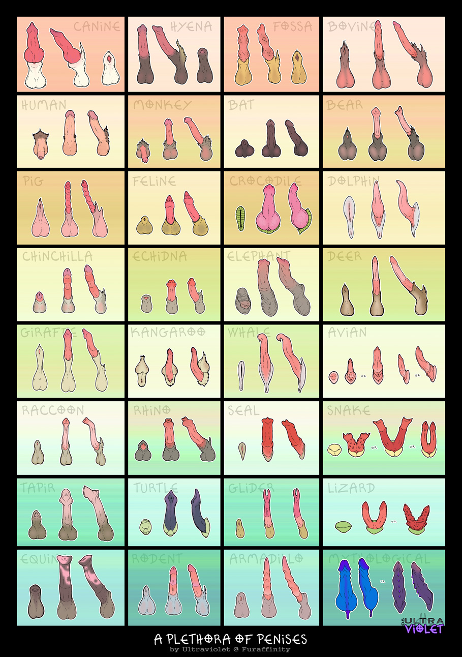
Ozelot said:
anyone know where I can find some excellent horse cock references?don't want to make them look too humanish but I want to make them look nice
How's this? It can be used for other types too
Updated by anonymous
TheHuskyK9 said:
How's this? It can be used for other types too
I don't really reference from things that other people have drawn. Only exception is if it's reaaaally clear they drew it from life themselves.
Edit: That one looks okay but it's kinda small, hard to work from the details. It just kinda shows the rough shape of the flare and the size between the shaft between the balls/medial ring versus the tip/medial.
Updated by anonymous
Ozelot said:
anyone know where I can find some excellent horse cock references?don't want to make them look too humanish but I want to make them look nice
Google?
Updated by anonymous
WabaGrillOnFleet said:
Google?
Tried already.
Updated by anonymous
Ozelot said:
Tried already.
Updated by anonymous
parasprite said:
Here you go (sauce)
looks good, thx
Updated by anonymous
https://dl.dropboxusercontent.com/u/69023860/213.png
This is a veeery fast sketch (some minutes) I made as a sort of proof of concept. I am trying to invent a sort of semi-fantasy horse-like character with sapient intelligence.
Anything particularly un-horse-like about him? I am aiming at getting as much of the horse-ish character that I can get in as short an amount of time as I can, so that whenever I draw him he will look right from the beginning.
Updated by anonymous
Ozelot said:
https://dl.dropboxusercontent.com/u/69023860/213.pngThis is a veeery fast sketch (some minutes) I made as a sort of proof of concept. I am trying to invent a sort of semi-fantasy horse-like character with sapient intelligence.
Anything particularly un-horse-like about him? I am aiming at getting as much of the horse-ish character that I can get in as short an amount of time as I can, so that whenever I draw him he will look right from the beginning.
For some reason, the shape of the head reminds me more of a bull than a horse imo.
Updated by anonymous
Ozelot said:
https://dl.dropboxusercontent.com/u/69023860/213.png
This is a veeery fast sketch (some minutes) I made as a sort of proof of concept. I am trying to invent a sort of semi-fantasy horse-like character with sapient intelligence.
Anything particularly un-horse-like about him? I am aiming at getting as much of the horse-ish character that I can get in as short an amount of time as I can, so that whenever I draw him he will look right from the beginning.
Looks neat for being a quick sketch. But there is problems, I can't feel the essence of horse in this creature at all. it doesn't matter how do I look at it. Looks like a hybrid between a Rhinoceros and a Bull to me.
Updated by anonymous
Ozelot said:
https://dl.dropboxusercontent.com/u/69023860/213.pngThis is a veeery fast sketch (some minutes) I made as a sort of proof of concept. I am trying to invent a sort of semi-fantasy horse-like character with sapient intelligence.
Anything particularly un-horse-like about him? I am aiming at getting as much of the horse-ish character that I can get in as short an amount of time as I can, so that whenever I draw him he will look right from the beginning.
Is not bad at all! But like a couple others have said it does seem to look more like a bull than a horse. The forms are going to make changing that a challenge, but not impossible.
The things that need to change to make this more horse like are 1: the head shape, it's a touch too rounded, the muzzle could totally use some elongation, and adding those big horse nostrils would help a ton too. 2 the ears are also a bit too round, horse ears are pointier. 3 the trail is long and slender like a bull's as well, making it short and mostly hair would help.
I think that's about it! I can see how many of these things could be explained by "well it's a hybrid" but if your goal is to make it look more like a horse then I think these are good places to start
Updated by anonymous
https://dl.dropboxusercontent.com/u/69023860/214.png
Some sketchy attempts at some healthy horse dick based on some of those refs before I try drawing one getting slammed into my char's ass .-.
Updated by anonymous
Ozelot said:
https://dl.dropboxusercontent.com/u/69023860/214.pngSome sketchy attempts at some healthy horse dick based on some of those refs before I try drawing one getting slammed into my char's ass .-.
Looks good
post #391246
Updated by anonymous
Mind if I revive this thread with some NSFW digimon stuff (And full gay)
Is a WIP, it's going to be full color and the sort, but I think it's alredy good as a base.
https://www.dropbox.com/s/jh2eey2mplko9an/WP_20150518_003.jpg?dl=0
Updated by anonymous
NoctemWerewolf said:
Mind if I revive this thread with some NSFW digimon stuff (And full gay)
Is a WIP, it's going to be full color and the sort, but I think it's alredy good as a base.
https://www.dropbox.com/s/jh2eey2mplko9an/WP_20150518_003.jpg?dl=0
Updated by anonymous
NoctemWerewolf said:
Mind if I revive this thread with some NSFW digimon stuff (And full gay)
Is a WIP, it's going to be full color and the sort, but I think it's alredy good as a base.
https://www.dropbox.com/s/jh2eey2mplko9an/WP_20150518_003.jpg?dl=0
Bouncing off what Husky mentioned, I'd recommend using references for the pose and characters alongside the individual anatomical features such as hands and feet. The body should indicate it's bearing some form of weight--like what you had going with Weregarurumon(?)'s right arm.
You did a good job rendering the lefthand figure's torso, I'd say, so good on you there, though I agree with Husky's assessment of it: unless you're going for Rob Leifeld proportions, avoid giving a character limbs that are thicker around than their torso. I know that Digimon isn't a series known for believable anatomy, but trying to take on giving the characters a similar anatomy to what is seen there at this stage would mean changes that aren't feasible to make without a lot of erasing. Also make sure that the shape the torso and chest take makes sense with the curve of the spine. If the character's back were arched, the chest and abs would reflect that as well. His arm would more than likely need to be placed further back, since right now, were you to draw his hand in, it'd end up being lower than the placement of Leomon(?)'s heel, which sits outside it.
I'd also strongly recommend including their opposing limbs, since even a completely side-on view is going to include body parts that are further from the viewer/camera.
Updated by anonymous
TheHuskyK9 said:
- Gotta make Leomon's toes gradually get smaller from the big toe
- Scanners are wonderful. If you have the funds, I recommend this one
- Practice drawing circles and squares. Practicing circles will improve your curves and practicing squares will improve your straight lines.
- The Were's body is too slim. His arm is thicker than his mid section. You want to have it even or his body thicker than his arm
Misappropriated said:
Bouncing off what Husky mentioned, I'd recommend using references for the pose and characters alongside the individual anatomical features such as hands and feet. The body should indicate it's bearing some form of weight--like what you had going with Weregarurumon(?)'s right arm.
You did a good job rendering the lefthand figure's torso, I'd say, so good on you there, though I agree with Husky's assessment of it: unless you're going for Rob Leifeld proportions, avoid giving a character limbs that are thicker around than their torso. I know that Digimon isn't a series known for believable anatomy, but trying to take on giving the characters a similar anatomy to what is seen there at this stage would mean changes that aren't feasible to make without a lot of erasing. Also make sure that the shape the torso and chest take makes sense with the curve of the spine. If the character's back were arched, the chest and abs would reflect that as well. His arm would more than likely need to be placed further back, since right now, were you to draw his hand in, it'd end up being lower than the placement of Leomon(?)'s heel, which sits outside it.
I'd also strongly recommend including their opposing limbs, since even a completely side-on view is going to include body parts that are further from the viewer/camera.
Well Thanks, I worked enough time on the torso, indeed I think it needs to make an arch and make the pose flow with the muscles.
Honestly I tried to keep on the body proportions they have on the shows, but it's so... unreliable, I ended drawing a massive arm right there.
As for the opposing arms, I didn't drew them because I wanted some feedback first before drawing them, because I don't want to erase half of the picture.
And lastly for the scanner. I was too lazy to actually use it XD.
Thank you guys, I'll take the advices and show an improved picture soon.
Updated by anonymous
NoctemWerewolf said:
Well Thanks, I worked enough time on the torso, indeed I think it needs to make an arch and make the pose flow with the muscles.Honestly I tried to keep on the body proportions they have on the shows, but it's so... unreliable, I ended drawing a massive arm right there.
As for the opposing arms, I didn't drew them because I wanted some feedback first before drawing them, because I don't want to erase half of the picture.
And lastly for the scanner. I was too lazy to actually use it XD.
Thank you guys, I'll take the advices and show an improved picture soon.
When it comes to animation, studios often have to cut corners, leading to characters sometimes appearing 'off model'. If you were going to use references from the series, I'd recommend finding the concept art or character sheets for the respective 'mons. In general it's best to decide beforehand whether you want to go for realistic or cartoonish proportions early on, because changing your mind in the middle of a project will lead to issues.
Best of luck o/
Updated by anonymous
My clothes are all rot after waiting for that review of this post #653839
Updated by anonymous
