Topic: [BUG] Bad display on tag description (invisible text)

Posted under Site Bug Reports & Feature Requests

Invisible text on e621.net tag description

The tag description text for yokarion_(character) is invisible in all states (default, selected, expanded). Text is confirmed present in the HTML but not rendered visibly.

Affected pages:
https://e621.net/posts?tags=yokarion_%28character%29

Steps to Reproduce
1. Visit the above URL.
2. Locate the tag description box.
3. Observe the description area below the tag name.
Expected: Visible text describing the tag.
Actual: Blank space (text is present but invisible).

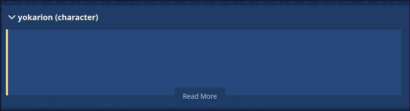
Default state: https://yokarion.com/wp-content/uploads/2025/06/image.png
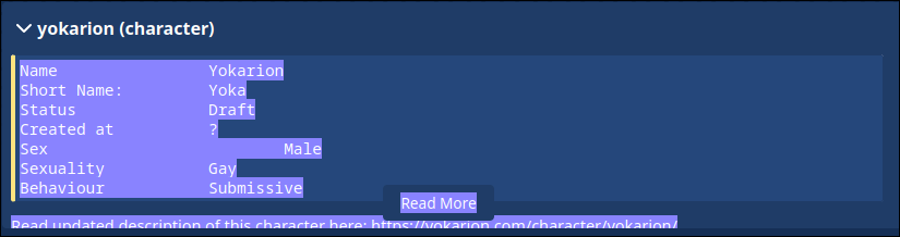
Selected state: https://yokarion.com/wp-content/uploads/2025/06/image-2.png
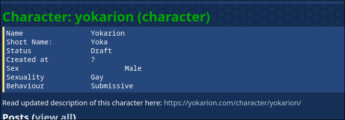
Clicked read more: https://yokarion.com/wp-content/uploads/2025/06/image-3.png

Proposed fix:
.wiki-excerpt .styled-dtext style has color: transparent for some reason. If I disable this, the text appears normally.

Environment
OS: Windows 11
Browsers: Firefox (ublock origin), Chromium (no extensions)

Status is tracked on this url: https://yokarion.com/blog/invisible-text-on-e621-net-tag-description/

The dropdown descriptor when you search a single tag is inconsistent for me
Some days I see it, others (like now) I don't

Firstly, e6 is open-source, so it might be wise to put this as an issue on the GitHub repository .

nin10dope said:
The dropdown descriptor when you search a single tag is inconsistent for me
Some days I see it, others (like now) I don't

I think if you close it out on 1 tag, it stops showing up for all of them (I accidentally did so & had to open an Incognito Window to get it to show up again; no idea where this flag is stored though).

yokarion said:
Proposed fix:
.wiki-excerpt .styled-dtext style has color: transparent for some reason. If I disable this, the text appears normally.

It doesn't; it draws underneath the Read More box. The reason it's transparent is because of the mechanism used for the gradient is the background-clip property. As said in that link,

...the background-clip: text property has little to no visual effect if the text is fully or partially opaque.

Here's the CSS:

.wiki-excerpt .styled-dtext {
  background: linear-gradient(to top,var(--color-section),var(--color-text));
  -webkit-background-clip: text;
  background-clip: text;
  color: transparent;
  ...
}

The background is a linear gradient from the background color of the excerpt (--color-section) at the bottom to the normal text color (--color-text) at the top. background-clip: text; means the background is only drawn when it "clips" (i.e. intersects with) the text content. You can actually guess this without opening the CSS, as the highlighted left border of the code block doesn't have the gradient drawn over it (another flaw of this approach), as the clipping only occurs with text content directly inside the box (which is why text content in a child element isn't clipped). The parent element (w/ class wiki-excerpt) has a background the same color as the styled-dtext child element that contains the actual info, so it appears uniform.

The real fix would be to remove transparency & add an element over the preview with the gradient background. This would fix everything, but it's also a colossal pain. I've been trying to mock it up for the past hour, & it's not simple w/o either uniform/localized changes to the CSS for all DText elements or reworking the preview layout itself. Ideally, adding an element as the last child of the styled-dtext element w/ styles like

.gradient-overlay {
  background: linear-gradient(to top,var(--color-section),transparent);
  position: relative;
  top: -100%;
  padding: 0;
  max-height: 10rem;
  min-height: 2rem;
  height: 100%;
  box-sizing: border-box;
}

would suffice, but it won't work correctly b/c it doesn't take into account the slight variances in initial position caused by the margins, borders, & padding of the DText elements. You can add margin-top: -1.75em; to get closer in this example, but it's still slightly off, & would be even more off on wiki pages with little or no padding. This, placed as the first child of the styled-dtext element is closer:

.gradient-overlay {
  background: linear-gradient(to top,var(--color-section),transparent);
  position: absolute;
  top: 3rem;
  padding: 0;
  margin-top: -1.75em;
  max-height: 10rem;
  min-height: 2rem;
  height: 100%;
  box-sizing: border-box;
  width: 100%;
}

Though this might still be screwy at certain resolutions/window sizes.